
Research
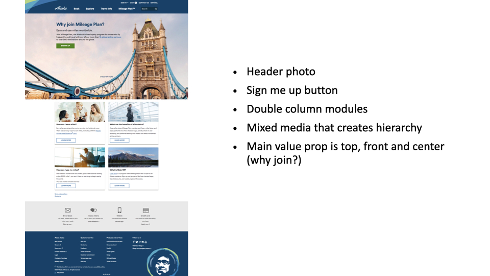
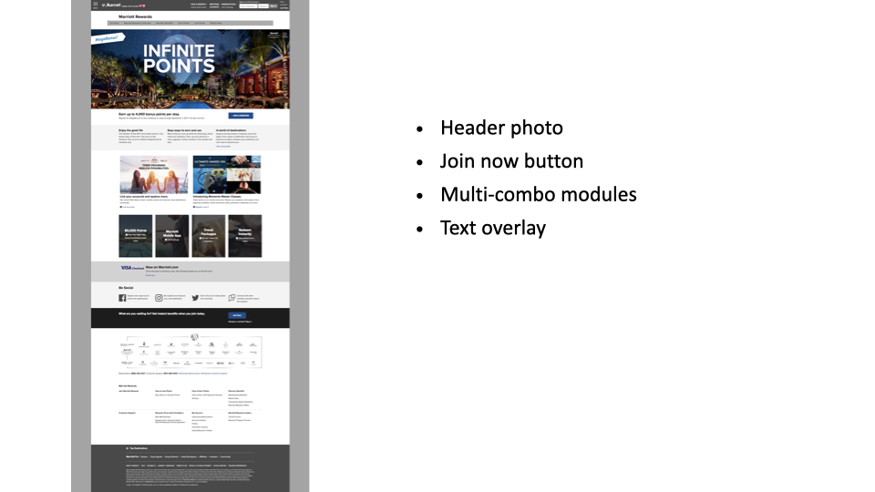
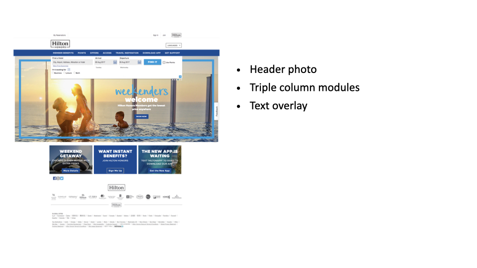
Through analyzing loyalty programs at Alaska Airlines, Marriott, Hilton, Hotels.com, and Starwood Hotels, key UX patterns emerged:
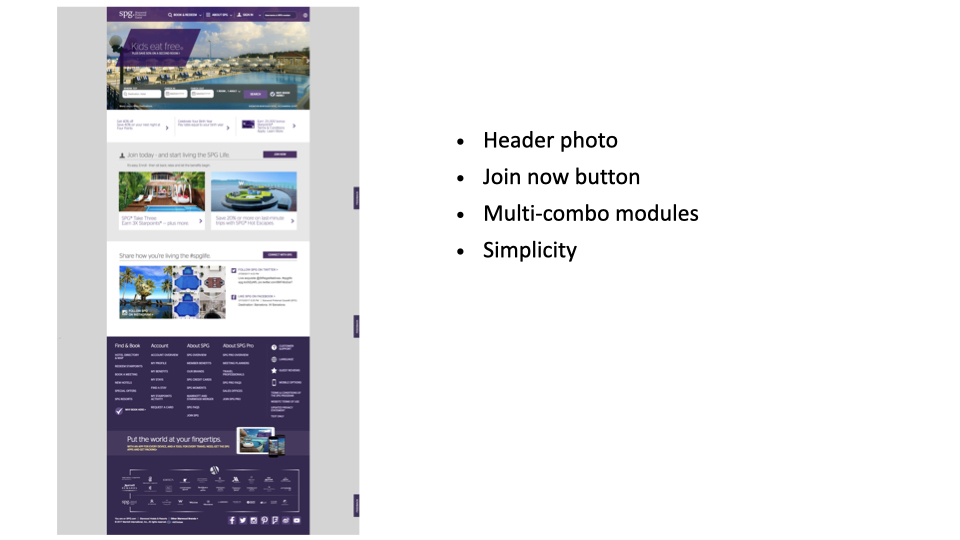
- Clear visual hierarchy (header photos + ‘Join Now’ buttons above the fold)
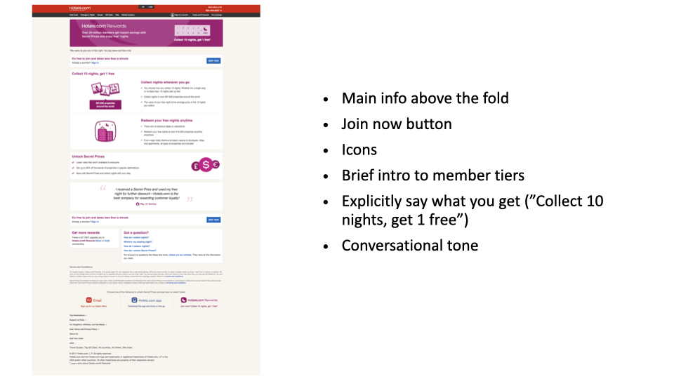
- Scannable value propositions (tiered benefits, conversational copy like Hotels.com’s ‘Collect 10 nights, get 1 free’)
- Modular layouts (double/triple columns, mixed media) that balance simplicity with engagement.
Alaska Airlines and Starwood stood out for front-loading ‘why join?’ with bold imagery, while Hotels.com excelled at transactional clarity. These insights informed my approach to balancing aesthetic appeal with conversion-driven design
UX Process & Solutions (Old Pages)
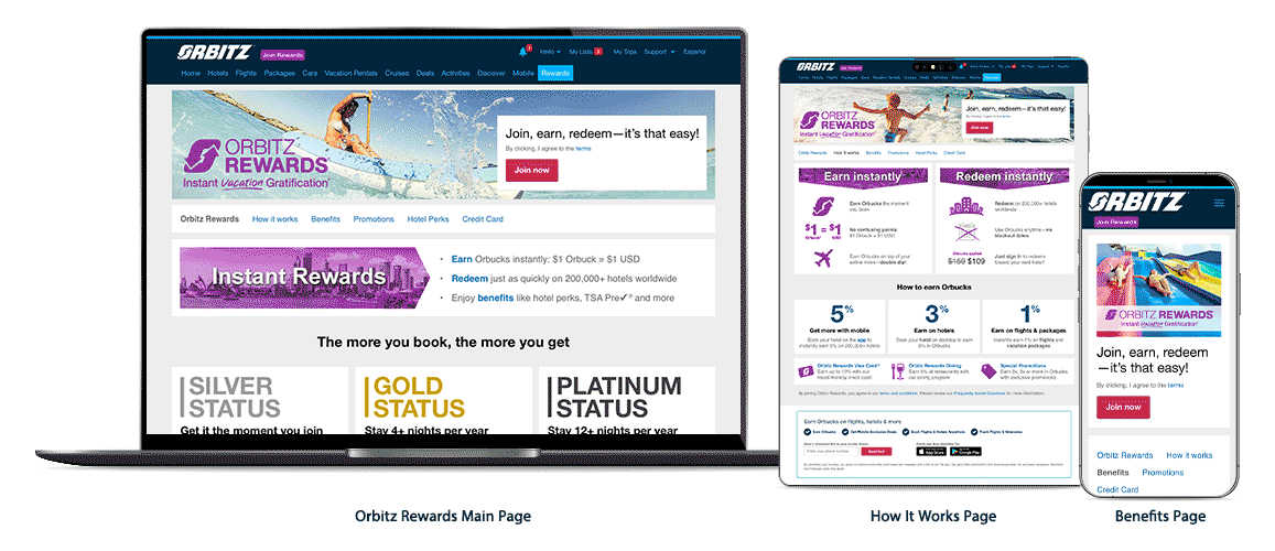
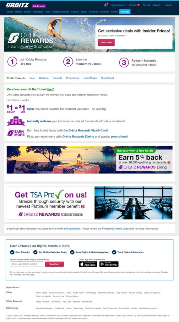
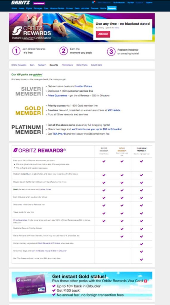
Building off of the existing Orbitz Rewards Pages, we needed to move content up in the hierarchy for users to better understand the program at a glance. The existing pages complicate the experience with too many clicks to locate core information and actions. This project is to solve three main user problems:
- Accessing and redeeming platinum member benefits
- Basic program understanding
- Understanding tier levels
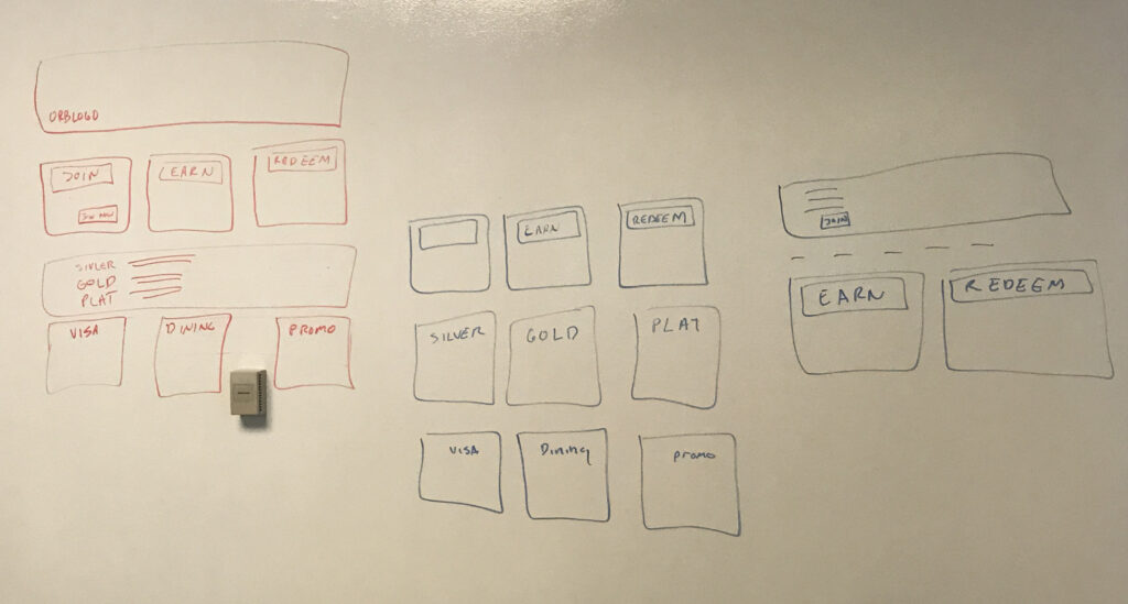
Wire Frames
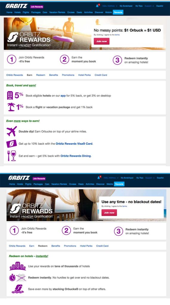
Applying lessons from industry leaders, my Orbitz Rewards wireframes optimized loyalty UX through:
- Clarity-First Hierarchy
- Single-page program explanation (like Alaska Airlines’ scannable value props)
- Dedicated ‘Tier Benefits’ page mirroring Hotels.com’s transactional clarity
- Progressive Disclosure
- Base experience for all users (Marriott-style simplicity)
- Logged-in members unlock redemption CTAs (Starwood-inspired engagement)
- Conversion-Driven Modules
- Mixed-media layouts adapted from Hilton’s columns
- Benefit icons and tier visuals inspired by Hotels.com’s instant comprehension
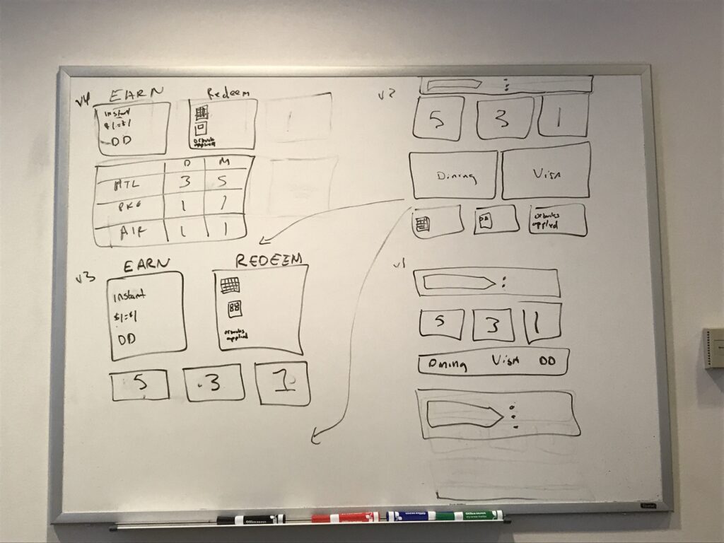


Iterative Refinements: Key UX Insights | Software: Sketch
- Main Page: Hero Imagery
- Problem
- Competing photos created visual conflict.
- Solution
- Designed a single duotone image in a dynamic shape that naturally guides users to the adjacent copy.
- Problem
- How It Works Page: Program Mechanics
- Problem
- Stacked copy and bulky blue icons hindered readability.
- Solution
- Replaced rows with side-by-side columns (EARN vs. REDEEM)
- Decoupled icons from amounts for clearer hierarchy
- Simplified to one line of copy per action
- Problem
- Tiered Benefits Page
- Problem
- Excessive scrolling, dense duotones, and unclear progression.
- Solution
- 3-column layout for instant tier comparison
- Framed icons replaced solid blocks (reducing visual weight)
- Step-by-step copy (“Platinum choice 1: Pick… Platinum choice 2: Plus…”)
- Problem
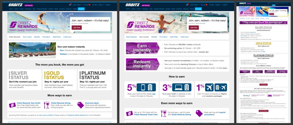
In-Person Usability Study
We performed an in-person usability test with participants in our rewards program as well as high-end users reluctant to participate. Testing revealed users overlooked the reward program’s value because critical details were hidden in paragraphs below a lengthy form; and existing users only signed up to the program to obtain an immediate discount and were unaware of the additional value of using the memberships and the tier differentials that included additional savings. This testing was done in a two-way mirror room where we tracked eye movement, cursor heat maps, and voice/facial observations.
What we found out users tend to quickly click over to the ‘How it Works’ page. The ‘Earn & Redeem’ page process was a bit confusing. The ‘Benefits’ page was an overload of information. I worked with the content team to simplify the language on the ‘Earn & Redeem’ page. The ‘Benefits’ page was redesign to have expandable options to shorten the page.