UX Process & Solutions
- Research & Discovery
- Conducted user interviews/surveys with target buyers/sellers to identify frustrations.
- Example insight: “Users wanted faster access to neighborhood specific properties that tied into their existing inventory but found the information typically buried in areas they had no intention of investing
- Example insight: “Inexperienced residential agent in commercial/multifamily transactions, lack of trust in agents.”
- Analyzed competitor UX patterns in real estate (e.g., Kiser Group, AIA,).
- Define user personas (e.g., first-time buyers, investors, sellers, and foreclosures)
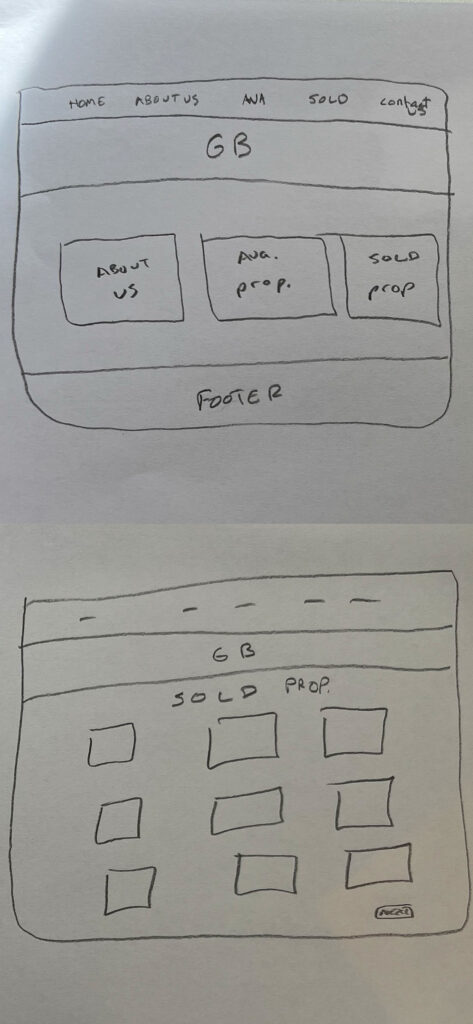
- Designed low-fidelity wireframes to test layout logic
- Conducted user interviews/surveys with target buyers/sellers to identify frustrations.
- UI Design & Brand Integration
Because Greyson Brokerage was a new firm trying to establish itself in an overpopulated market, I really enjoyed building this product from the ‘studs’ to the ‘roof’. It was a unique opportunity to combine my skill in design and UX. My additional efforts included:- Researching competitive real estate firms
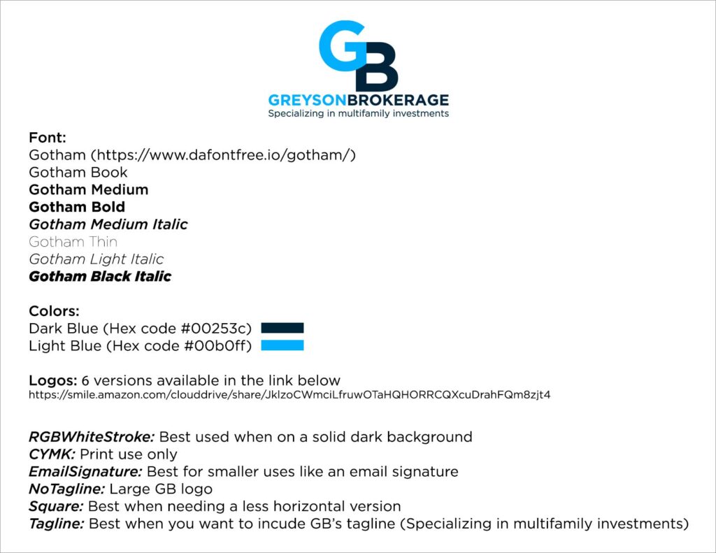
- Creating GB Logo
- Performed TA user testing
- Designing and launching desktop and mobile version of their website
- Establishing a modern style guide to be used across all products from website, email, and print.
GB Logo & Style Guide
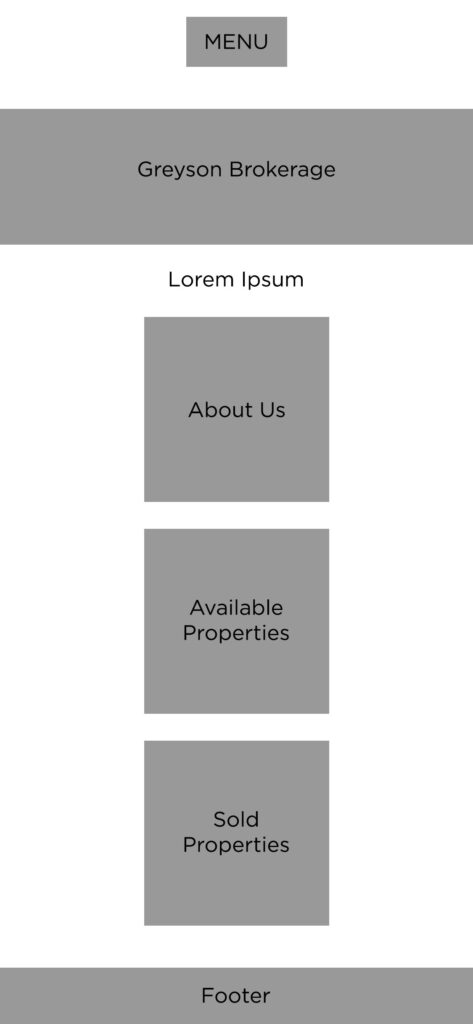
Wire Frames

Think Aloud User Testing
With a limited budget from GB, I decided to perform a ‘Think Aloud’ user testing. What I found out was property owners wanted to know what their property is worth and not necessarily wanting to click on the contact us menu at the top of the header. I created an icon box offering a free property evaluation. I also added a market news section since GB mails out quarterly newsletter. The last box was highlighting the property management side of their business.
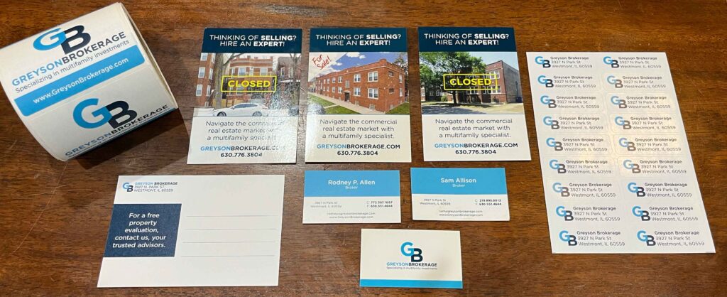
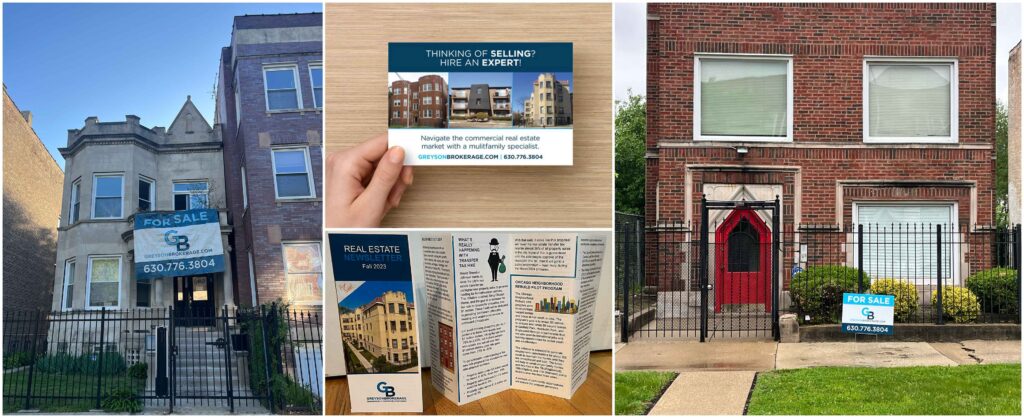
Print Design