UX Process & Solutions
- Research & User Needs
- User Interviews/Surveys: Travelers wanted quick access to:
- Must-see attractions vs secluded and hard to find events
- Real-time event calendars
- Transportation hack
- Competitor Audit: Analyzed Airbnb Experiences, Lonely Planet, and local tourism boards for UX patterns.
- Personas: Defined key user types
- User Interviews/Surveys: Travelers wanted quick access to:
- Information Architecture (IA)
- Structured content into three priority sections:
- “Plan Your Trip” (Destinations, itineraries).
- “Get Around” (Maps, travel guides)
- “Local Events”
- Designed a sticky navigation bar for quick jumps between sections
- Structured content into three priority sections:
- Wireframing & Prototyping
- Low-fi Wireframes: Tested layouts for scannability
- Visual Design & Branding
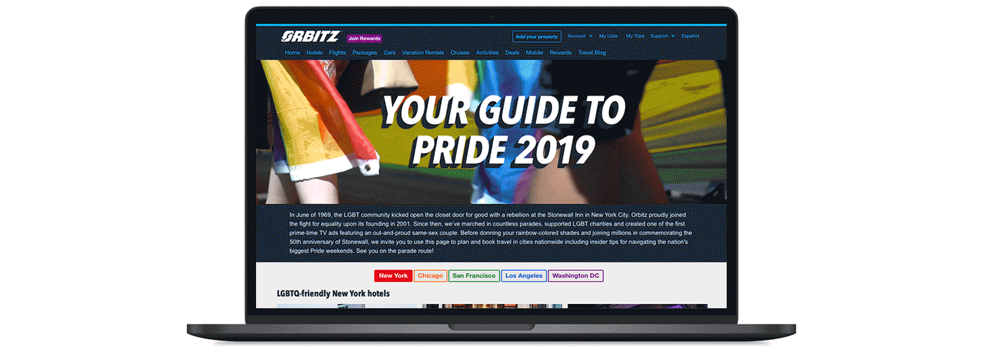
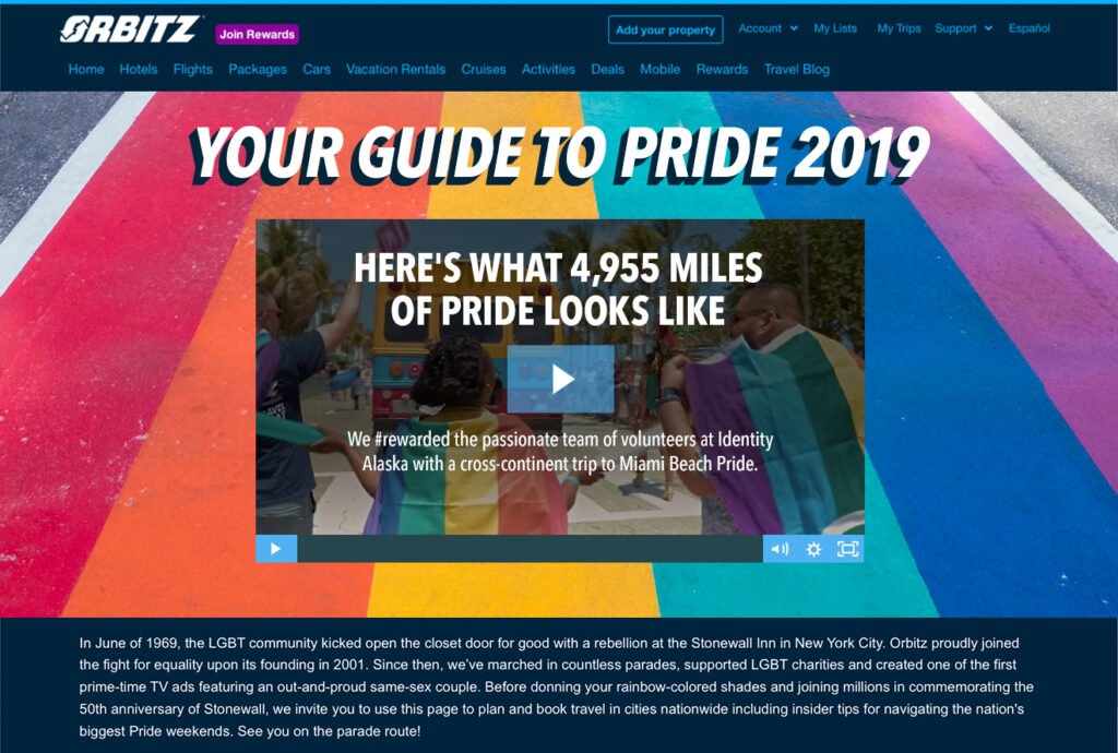
- Imagery: Stock photography + user submitted photos from Miss Richfield, a well know Drag Queen featured in the ad.
- Color/Typography: Vibrant accents paired with clean, readable text.
- Usability Testing & Iteration
- Added a “Queer Friendly” hotel feature for travelers
- Simplified the City Menu to include colors with matching icons
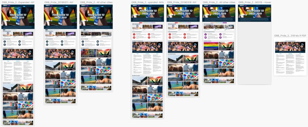
- Integrated InVision to give users a more interactive prototype
- Outcome & Impact
- Click Rate 113% above average from BOS of Pride to EOS
- Adopted as the company’s official Pride tourism microsite
Wire Frames
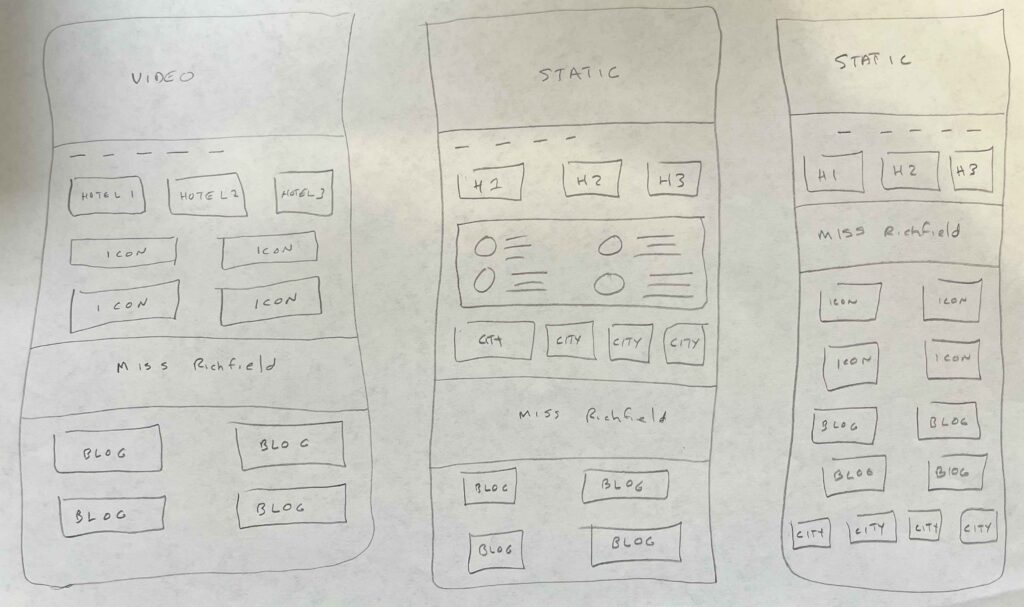
Sketch
Video Header
Think Aloud User Testing
Without the support of going to Seattle, I decided to load the pages into InVision. This gave the user a more interactive prototype to view the pages. What I found was that users didn’t know about the multiple cities until they scrolled down near the footer of the page, I edited the city menu to include colors with the icons matching the city color too. I also noticed the page was very long when viewing the NY page under Miss Richfield’s recommendation. A solution was to have a dropdown icon where the heavy copy can expandable for a user.