
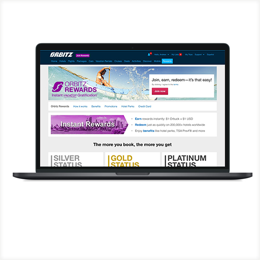
As the senior designer for the Orbitz Rewards Pages, I needed to move content up in the hierarchy from the old pages for users to better understand the program at a glance. I worked with the UX researcher, content team and loyalty team. I went to the Seattle office to see and learn how my pages interacted with participants. We perform an in-person usability study/test on 5 or 6 participants through the membership process and check for their understanding of the different tiers and aspects for each rewards. This was done in a two-way mirror room where we got to track eye movements, cursor heat maps and voice/facial observation.
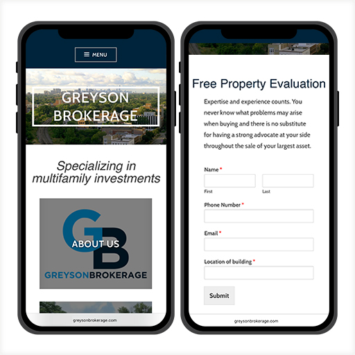
Greyson Brokerage is a commercial real estate brokerage firm specializing in the acquisition and disposition of apartment buildings in the Chicagoland area. They specializing in multifamily investments. I create the desktop and mobile version of the website, designed the GB identity/logo, established a branding style guide and marketing web/print materials. I perform a Think Aloud user testing on 3 participants using a desktop wireframe.
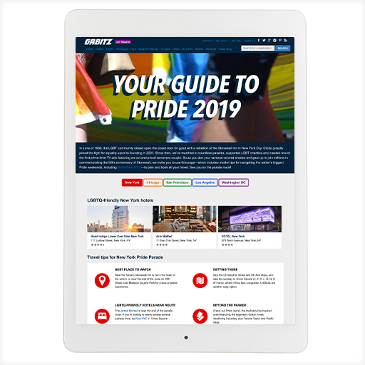
Orbitz Pride landing page was really fun to design. I collaborated with the brand team, video vendor, content team and Miss Richfield who is a famous drag queen performer. This page was design as a pride guide to 5 popular cities from where to eat, where to stay, best places to watch the parade and getting around the city. I designed the pages and loaded them into InVision to create a more interactive prototype for Think Aloud user testing.

With the success of Orbitz Rewards, I was asked to create the Ebookers Bonus+ desktop and mobile site for the Main page, How It Works page and the Benefits page. With limited resources on user testing, I performed a Think Aloud user testing. I worked with the content team and loyalty team.

Maryland.gov has five common problems (typical with government websites), which includes outdated information, broken links, poor data presentation, empty meeting minutes and missing information. In my experience, I have found that many government websites tend to be built for internal stakeholders and not focused on actual user needs. My goal was to create a site that addresses the needs of our two audiences: government and public, requires incorporating some best practices: consistency, jargon free language, grouping of functions, icons with unbroken links, and a persona, and usability testing.